Showing posts with label in progress. Show all posts

Sunday, September 10, 2017

Matters of Taste - The Universal Flavors Collection


The relationship between food, plating, and flavor perception is a diverse network of empirical experiences. Articulating taste in food within the general area of image-making, however, presents its own set of problems. Individual discernment and subjectivity create difficulty in visually defining these elements. Ephemeral by nature, an eating experience is shaped by personal preference. Unable to visually translate ideas of taste beyond my own consciousness, I focused on my own interpretation of meals created by the other resident artists (from Denmark, Sweden, Switzerland, Estonia, New Zealand, the United States, and Japan).

From a mind and mouth perspective I interpreted the five universally recognized basic tastes – sweet, sour, bitter, salty, and umami (savory) into shape templates to make molds of. I chose the five basic tastes as a comprehensive approach to categorize the cornucopia of ingredients available for human consumption. I also thought about what food the pieces were meant to contain as related to each flavor and investigated how form, color and texture could visually translate these flavor perceptions into ceramic objects.

Over the course of my six-week residency at Guldagergaard, I designed and fabricated a mold or a group of molds for each flavor. I had not done much mold making previously so I was teaching myself mold making while trying to navigate the project perimeters I invented. It was a fun and fruitful challenge. The center has great mold making facilities and I forced myself to stay off the wheel for my entire stay to really dig into a new process without the distractions of making work I am comfortable making.

In that same spirit I restricted myself to formulating colored slips for casting that would add visual interest without any decoration. My goal in making molds was to potentially integrate pieces into my work that I can quickly reproduce and to explore the importance of design in my work, why and how I use it as a vehicle to communicate ideas through my pieces.

After my glaze firing I brought all the pieces into the kitchen and asked the other residents to play with and arrange them. Through their play, I realized there was a game-like element to mixing and matching the flavor forms, creating different and various combinations. I found this unexpected aspect of the work rather exciting.

The body of work that resulted incorporated the shapes I felt had the strongest association to each flavor from my series of food memory drawings. The yellow coffee cup represented Bitter. The oval bowls were Sweet for fruit or ice cream. Table salt cellars ramekins were for Salty. Bread and butter dishes with spreading knife to represented the flavor of Umami. I had some indecision for the Sour form. I ended the residency making a mixing spoon for lemonade. However, I had earlier iterations of citrus squeezer forms that I hope to revisit and redesign to include in the collection. The initial drawing research had a profound effect on the compositions the pieces took on.

On the whole, I am delighted with how the collection turned out. As for the pieces themselves, I gifted the other residents some of the pieces for their involvement in the project and installed the rest in the kitchen of the resident house to be used for the family meals that inspired them.

Lastly, I would like to extended a BIG thank you to Northern Clay Center and the 2017 Warren MacKenzie Advancement Award for the support to complete this project!

Cottle boards set for plaster pour
Molds filled with colored Royal Copenhagen casting slip

Drying forms in molds

A variety of cast forms awaiting the bisque

I cast each form multiple times in casting slip colored with Mason Stains

Bird's eye view of mango, orange, and yellow dishes

The residents arranged flavor form combinations

It was an unexpected treat to see the multitude of combinations created by the artists.
Bitter

Umami

Sweet

Sour

Salty

Sunday, July 30, 2017

Exploring Local Design


INTRODUCTION

Denmark has a rich intellectual and artistic heritage. The Danes are a happy and proud people and have a special relationship with their country and their flag. The Danish flag is everywhere and has a name: “dannebrog”, which means “Danish cloth”. Legend has it that the flag fell from the sky during a battle of the Danish army against Estonia, when they were praying to God to save them from defeat – which worked. I think it’s a quite pretty flag. Its bold red and white colors look great on the background of a clear blue sky. Equally as important to Danish culture is the country’s arts and crafts. Danish artistic sensitivity spans into everyday life transforming architecture, furnishings, tableware, décor, and textiles that become functional art objects.
 
DESIGN MUSEUM DENMARK 
A visit to the Design Museum in Copenhagen provided an extensive look into the last century of Danish design. Of particular interest was a permanent exhibition entitled The Danish Chair, an International Affair. A diverse collection of chairs told the story of how Danish Modern became an international brand and trendsetting trailblazer. A stunning display of 100 Danish and international chairs line a hexagon-shaped room from floor to ceiling. Each chair is framed in its own clean white box, shown as a series of individual art objects. An homage to domestic design and craftsmanship, the exhibition emphasized 1920-1970, the pinnacle of Danish furniture design. Materials including wood, plastic, metal, and fabric make up a variety of chair styles such as armchairs, dining room chairs, folding chairs, lounge chairs, and rocking chairs. The design and fabrication of each chair was inspiring, yet gained a greater context and presence displayed as a collection. It staged a look into how design trends changed over the years and the many approaches to the modern chair in the 20th century.

“The chair is the piece of furniture that is closest to human beings. It touches and reflects the body that sits on it, with arms, legs, seat and back. It is a designer's touchstone and design history's favorite object. And the chair is one of the most culture-bearing design objects.” (Nikolina Olsen-Rule)

Journeying to the other side of the world without leaving the museum, the exhibition Learning from Japan, highlights the connection of Japanese art as a continued source of inspiration for Danish arts and crafts. Japanism has been a catalyst and important precursor to the modern Danish aesthetic that branded Denmark into a design nation in the 20th century. The exhibition includes 400 works of furniture, ceramics, painting and woodblock prints, textiles, sculptures and lamps. The idea for the exhibition is based on the book, “Influences from Japan in Danish Art and Design 1870-2010,” by exhibition curator and art historian Dr. Phil Mirjam Gelfer-Jorgensen. Inspired by elements of nature, intentional design, and quality craftsmanship, the connections between the two cultures are long-lasting and surprising. A shared commitment to form following function, simple lines, and timeless style in elegance, make apparent the thematic threads that tie these two design icons together. The strongest relationship I observed was both countrys’ belief in the beauty of things to make life better. From this concept stems the source for the aesthetic correlations brought to light by the exhibition’s juxtaposition of these two cultures.

DOMESTIC DESIGN 
Scandinavian design and its famed art objects are not bonded to the artistic institution in Denmark. Examples of Danish style can be seen in everyday architecture and décor, especially within domestic spaces. Described as being fairly minimalist with clean lines, Danish design is highly functional with effective style that is devoid of heavy elements. Only what is needed is used. Deriving this philosophy from inter-war art movements, Scandinavian design is sometimes referred to as democratic design, because of its aim to appeal to the masses through products that are accessible and affordable. However, in an effort to achieve balance, the designs were not stripped of their beauty to make them as easy to use as possible. This theme and continued examples of Scandinavian design where visible as I explored Copenhagen and Skaelskor. The studio and resident house were inspiring specimens of the country’s design sensibilities and histories. Being immersed in these spaces for six weeks had a profound effect on the designs for my ceramic work. Designing through experience and observation seemed effortless when surrounded by constant examples of good design and timeless beauty.

The Danish Flag is hung for national holidays and special events.


Japanese Textile, Design Museum, Denmark
Bridge Set, Design Museum, Denmark

Learning from Japan, Design Museum, Denmark


Learning from Japan, Design Museum, Denmark

Permanent Collection, Design Museum, Denmark
The Danish Chair, An International Affair, Design Museum, Denmark

The Danish Chair, An International Affair, Design Museum, Denmark

The Danish Chair, An International Affair, Design Museum, Denmark

Kitchen, Guldagergaard Resident House


Living Space, Guldagergaard Resident House

Library, Guldagergaard Resident House


Sunday, June 25, 2017

2017 Warren Mackenzie Advancement Award: Residents in the Kitchen

INTRODUCTION

In everyday life food is never presented or served in isolation. Food is always placed in a container either disposable-like packaging or indispensable such as a plate or a bowl. My investigation of plating and platewares has led me to a residency at Guldegargaard International Ceramic Research Center in Skaelskor, Denmark. I started my research investigating the formal elements of dishware, such as color, size and shape that psychologically influence the way in which food is perceived. This commonly neglected element of a meal can affect everything from how we perceive the taste of food to how much we eat. Of particular interest are the socially constructed notions of the likely 
taste and flavor of foods contained in ceramic wares.

SIZE MATTERS 
  • Size, Shape, and color have an effect on the flavor perception of food. 
  • Blue = salty
  • Red = Sweet
  • Green = sourness 
JUST FACTS
  • People are happier with smaller portions off of a blue plate
  • Color contrast illusion – look it up, grapes look redder on a blue plate
  • Plate = background (could this be foregrounded?)
  • White is best for dessert plates.
  • Law of opposites, round food needs a square or rectangular plate
  • Aesthetic choices can inform how the diner responds to the dish
THE PROJECT
I choose Guldegargaard for the opportunity to work with an international population of artists that have an appreciation for the hand and the acceptance of the individual elements in life, both in living and making. As well as for the evening meal rota they practice there. The residents of Guldagergaard take turns cooking a family meal each night. I planned to use the evening meal rota as research and development to document shared meals from different cultures. Each day creating a food memory drawing composition inspired by a dish or ingredient from the last night’s meal. The formal elements of the drawings will inform visual connections between the basic flavors of a meal and individual flavor experiences. I look forward to being inspired by new people, familiar and foreign flavors, and fresh possibilities.

This research will inform the design and fabrication of five slip-casting molds. The forms will be a line, or related series of individual ceramic pieces. This line of functional tableware will be intimate in scale, suitable for one or two person utility. Asymmetry and clean lines will characterize the resulting forms. From a mind and mouth perspective I will interpret the five universally recognized basic tastes – sweet, sour, bitter, salty, and umami (savory). Through form, color and texture I will visually translate these biological flavor perceptions into sensorial ceramic objects.

A scene from Copenhagen, Denmark. Copenhagen is historically a maritime city and harbor. The residency is  two trains, a bus ride, and short walk to the resident house in Skaelskor, Denmark from the Copenhagen Airport.
Skaelskor, Denmark is home to the residency as well as loads of wide open spaces. It is the perfect destination for peaceful respite from fast paced city life and uninterrupted studio time for creative development.
This is Guldagergaard International Ceramic Research Center. The studio use to be a farmhouse for a fruit orchard. The ceramic residency is celebrating its 20 year anniversary in July.
There is typical 6 to 13 residents and staff living and working there at one time. The stay duration range greatly and artists come and go on individual schedules. It also seemed a common trend to extend the stay time. I stayed an extra half a week, and this figure sculptor from New Zealand, Jim Cooper, came for a 6 week residency last September and has stayed for eight months. The studio manager calls Guldagergaard the "Health Farm" because its such a quiet and restful place, and the residents are taken care of and well feed.
One of the main reasons I choose this residency out of all the wonderful international options for residencies is the evening meal rota the residents participate in. Each night the residents take turns cooking for the whole house. Meaning that about once a week I took time off from studio for half a day to make a large family meal for dinner. As much of my form research is food focused, I decided to use these meals as an avenue for research.

I wanted to investigate the relationship between plating and plateware on the multisensory perception of food. I used the evening meal rota as research and development to document shared meals from different cultures.
The morning after each meal I would create a quick food memory drawing using the visual and sensorial elements of a particular dish from the night before. The formal elements of the drawings will then informed visual connections between the basic flavors of a meal and individual flavor experiences. This drawing was meant to capture a Danish delicacy Sister Bread made with beer. Sweet and grainy characterizes its flavors.

 This drawing was inspired by a black rice, sweet potato, and ginger dish made my Joe, a Chicago native artist.

A memory of cucumber salad with pomegranate and mint. The early drawings captured more representation elements based on the color and shape of the food. The later drawings became more abstract.

A memory of a nut loaf bread made by Danish Artist Dorte. She had the most interested baking methodology I have ever seen. She threw ingredients together in a large mixing bowl relying only on instinct of a recipe that had been made time and again. There was no measuring or concern for proper dissolving of the yeast. The resulting bread was perfectly soft and fluffy; it tasted earthy, round, bold, and savory for the myriad of nuts in it.

Traditional ancient nut and seed bread. This Danish delight is made without any flour which yields an incredibly dense yet thinly sliced bread. The Danes are wild about their baked goods.

Each day my collect of food memories grew and I posted them in my studio space to influence the formal elements of dishware, such as color, size and shape that psychologically influence the way in which food is perceived.


A former orchard, Guldegargaard is celebrating its Twentieth Anniversary this year. The land surrounding the residency is a vast municipal park and often town’s people walking by peak their heads in the studio to see what’s being made. The town of Skaelskor is a quaint seaside town in the Slagelse municipality on the Danish island of Zealand. The town has a population of 6,532. And is home to one of Denmark's largest breweries, the Harboe Brewery. Some days the wind would shift and the whole town smelled like brewing hops.

WORKS CITED

Spence, Charles, and Betina Piqueras-Fiszman. "Chapter 4: Plating and Plateware: On the Multisensory Presentation of Food." The Perfect Meal: The Multisensory Science of Food and Dining. Chichester, West Sussex, UK: John Wiley & Sons, 2014. N. pag. Print.


Tuesday, December 20, 2016

Firing

The MN NICE students are getting their last kilns in as we complete the first Block of the year. Firing confidence is growing!

Tuesday, October 11, 2016

Mia Visit


The MN NICErs visited the Minneapolis Institute of Arts on our field trip this week. We recently read the Arcanum by Janet Gleeson and everyone was excited to see some of the Meissen pieces in person.

Thursday, April 23, 2015

Testing

Materials research projects are due soon, so everyone's in testing mode!

Tuesday, April 21, 2015

Slipcasting and 3D printing


Joel Froehle has been a guest instructor this year, taking us from clay body formulation to 3D printing. He talked about slip-casting bodies this week in preparation for Amy Santoferraro's lecture and demo.

Wednesday, April 1, 2015

Glaze Testing with Elizabeth


We've done several rounds of glaze testing so far with Elizabeth Coleman as guest instuctor. She joined us in class this week to help interpret results and figure out the next step in modifying the glazes.

Monday, February 16, 2015

Instagram

Amanda Dobbratz, Web and Communications Associate at Northern Clay Center, has been helping us fearlessly navigate social media this year. She joined us Monday for a discussion of Instagram.

Tuesday, February 3, 2015

Testing and Firing


Everyone has chosen a materials research topic to delve into over the next few months that relates to their work. This week was full of testing and firing. 

Friday, August 8, 2014

Kevin Kao: Introducing Alfred

This post is part of a series reflecting on my month-long stay at Alfred University, birthplace of ceramic wizards. Special thanks to the 2014 Warren MacKenzie Advancement Award through Northern Clay Center for helping me through a productive summer going into my thesis year!


Oh, Alfred University… Ranked as the top ceramic graduate program, it's garnered a lot of mystique and intrigue for many… well, maybe actually just me? Part of my reasons for going to spend a month at Alfred’s Summer Studio intensive was not only to gain access to new technologies and facilities, but also to experience what Alfred is about. It’s uncommon that an institution open its doors to allow people to experience what it means to be at one of the top ceramic academic programs. Furthermore, I hope that my experiences here, whether it be learning to use new technologies or interactions with faculty and graduate students, can help me prepare for an exciting thesis exhibition at my home institution, the University of Tennessee, Knoxville. 

So, I went to Alfred (summer studio) ....

Some quick notes about the city village of Alfred itself. 
- It’s actually called the village of Alfred, and yes, its a completely accurate.
- There’s one stoplight in the village.
- Nobody is around in the summer. Well, there are cows.
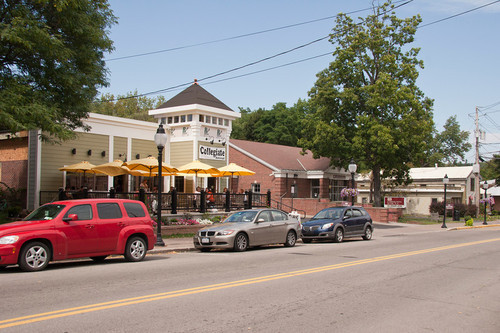
- There’s about 3 places to eat… Collegiate JET, anybody?!
- The nearest Target is about 1 1/2 hours away. T_T

The JET. $1 Tacos on Tuesday?!?! What.

Now that I’ve gotten that out of the way… the school itself is great! Facilities, working space and library resources are virtually unmatched for students that are interested in all things ceramic. The summer studio intensive is structured around a loose schedule with graduate students doing demoes, talks and loose critiques over your work. YES - exactly what I was hoping for! The Scholes Library, which specialized in all ceramic books, virtually has every single book/catalog/printed anything that has anything to do with ceramics. Perhaps even more valuable is their collection of MFA theses from alumni over the years… Hello Christina Cordova, Christina West and Jeremy Brooks~! Hubba hubba.

My Spacious Studio Space

The summer studio itself is comprised of 40+ students this year - about half of which are from various ceramic schools in Korea. This provided the program with an international exchange of ideas and information about various processes and techniques. Rather exciting, actually. Alongside the open-access studio format, daily demonstrations by the faculty and graduate students have covered a large spectrum of making in ceramics, ranging from building, surface techniques, printmaking and firing. This type of format serves independently driven students particularly well.
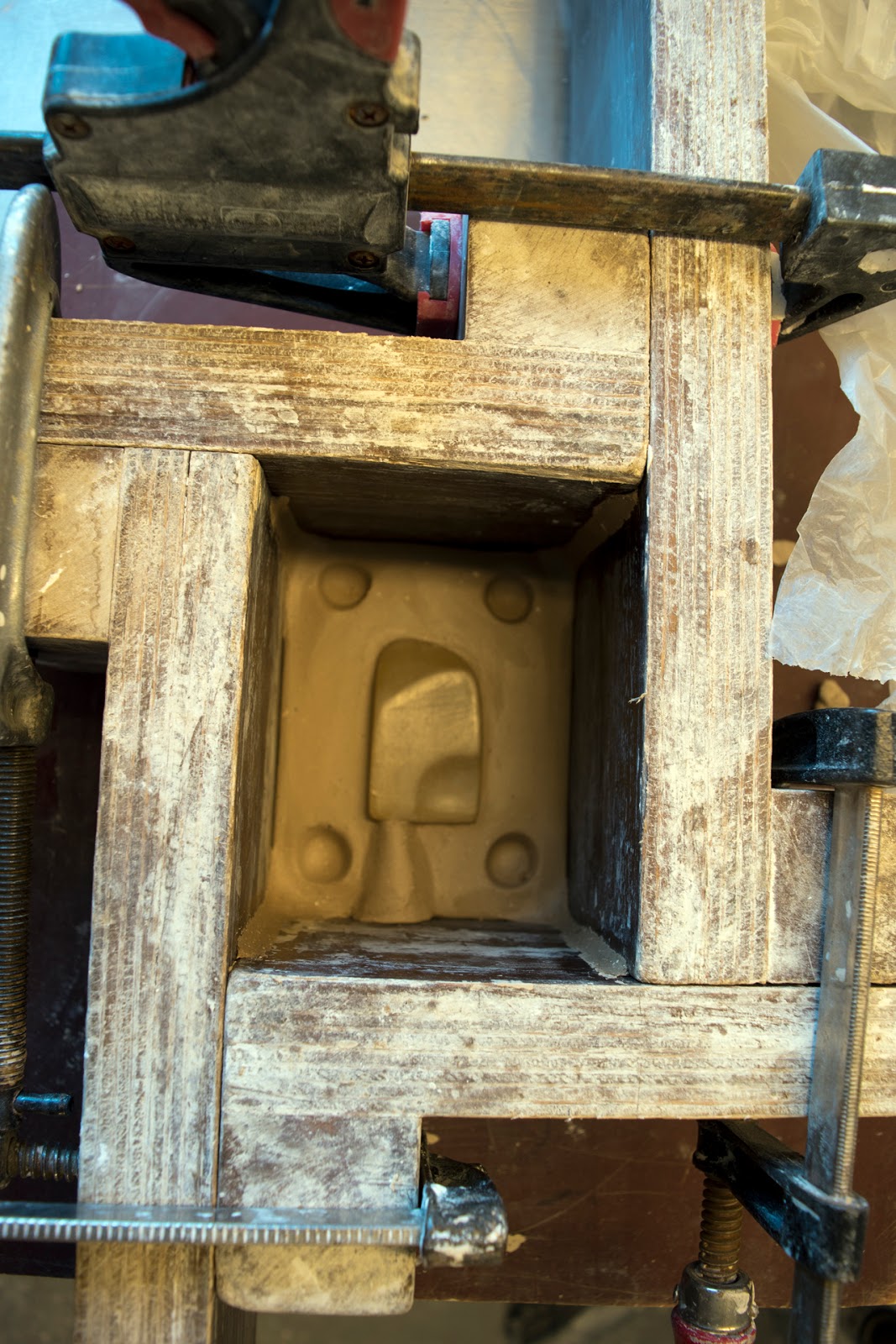
You lookin' at me?!

Part of my interests this summer has been to go through as many different ideas and processes to help me filter out what will work best going into my graduate thesis year. My last (3rd) year at the UT Knoxville is structured around building a thesis show. This means I’ve got approximately 9 months to produce a show. It’s pretty awesome. I’m using this summer opportunity to look at themes related to the historic Chinese production and representation of figurines. Whether created for export or for funerary purposes, Chinese figures and figurines have historically provided insight into costume and regalia - components which define purpose and role within individuals. I’m attracted to this relationship between individual identity and societal expectations. Clothing, hairstyle and costume are therefore approached as elements of performance that regiment each of us into our roles. These things show us who we are, but further what we are through their implications. (YAY SIGNS. YAY SEMIOTICS. <3 ROLAND BARTHES).

!!!
I think this is a good stopping point for now… A decent introduction to Alfred, the summer program and my interests in making. Look forward to more posts as I reflect further on my summer experience!

-Kevin Kao

Thursday, June 19, 2014

Getting Started

To begin my journey to completing the mural. I made a trip out to Philadelphia to survey possible sights that would work best for a sculptural mural. I first visited sites that were available to me through friends who were interested in supporting the project. I then met with the City of Philadelphia in order to find out what permission I would need to create this mural in a public space. The city explained that I would just need permission from the owner of the property. I was able to narrow my decision in terms of location because of the locations had an inset that would make a niche possible. 

During a second trip I met with a few fellow artist that have worked with mural projects before and got ideas on how to create a timeline and the best times of year to work. Philadelphia has a internationally renown mural arts program so and it is important to me to create a public piece of art that will pay homage to Philadelphia residents in as exceptional a way that the murals arts has done in the past. I met with InLiquid a Philadelphia organization that is interested in hosting an event where volunteers can get involved in the installation and possible create a garden alongside the mural itself. This idea is still in the beginning stages. In a meeting with Garth Johnson I found out Philadelphia will be having a mosaic mural conference and I was invited to take part in getting a better understanding of what this community could offer by attending events the Clay Studio of Philadelphia will run concurrently. 

One of the surprising elements is how many ceramic artist have shown interests in collaborating and volunteering their time to complete this piece in an exceptional way. 

Below is a picture of my drawing so far but I have to get to a scanner as I am away I do not have access. So please accept the previous writing as my "what I've done thus far" and I will be sure to get you images to support my previous steps. 

Ever Thankful, 

Roberto Lugo